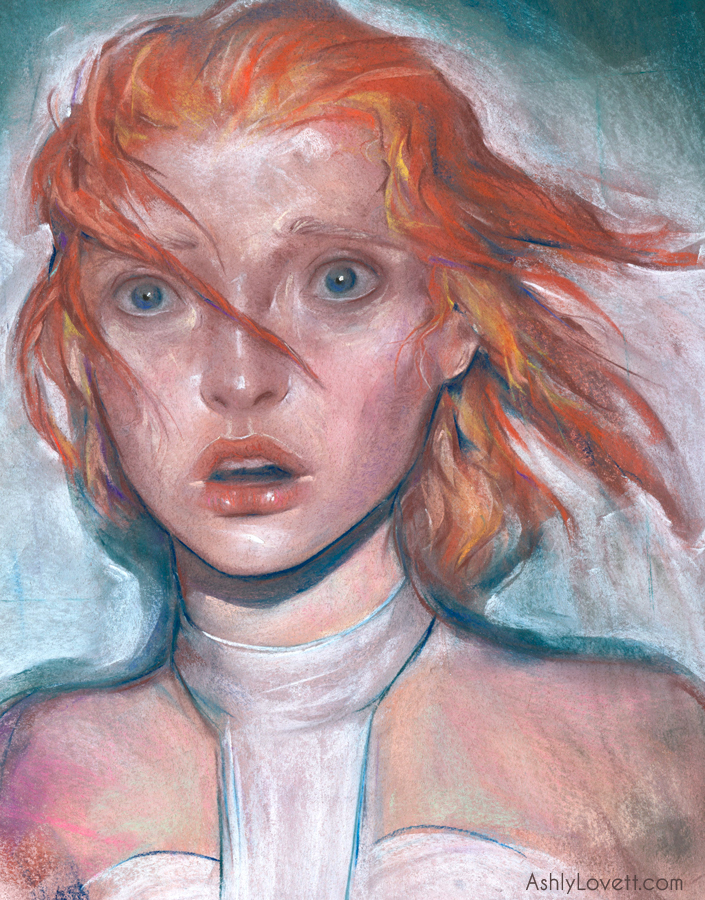
Every Day Original was at Society of Illustrator's MoCCA Art Festival in NY this past weekend with my "Furiosa" piece for sale. 4x6 original chalk pastel in a metal frame.
See a quick 15 sec process video here.
Illustration
Every Day Original was at Society of Illustrator's MoCCA Art Festival in NY this past weekend with my "Furiosa" piece for sale. 4x6 original chalk pastel in a metal frame.
See a quick 15 sec process video here.

The roster artists did a secret one last Month of Love day for the leap year! The theme was seasons and I highly suggest you check out some of the amazing work displayed today. I personally been wanting to do a series of flower faces. For this piece it needed to be bright and colorful! It is spring, which is full of life and energy. I do a lot of horror themed work and this is a good change in pace.
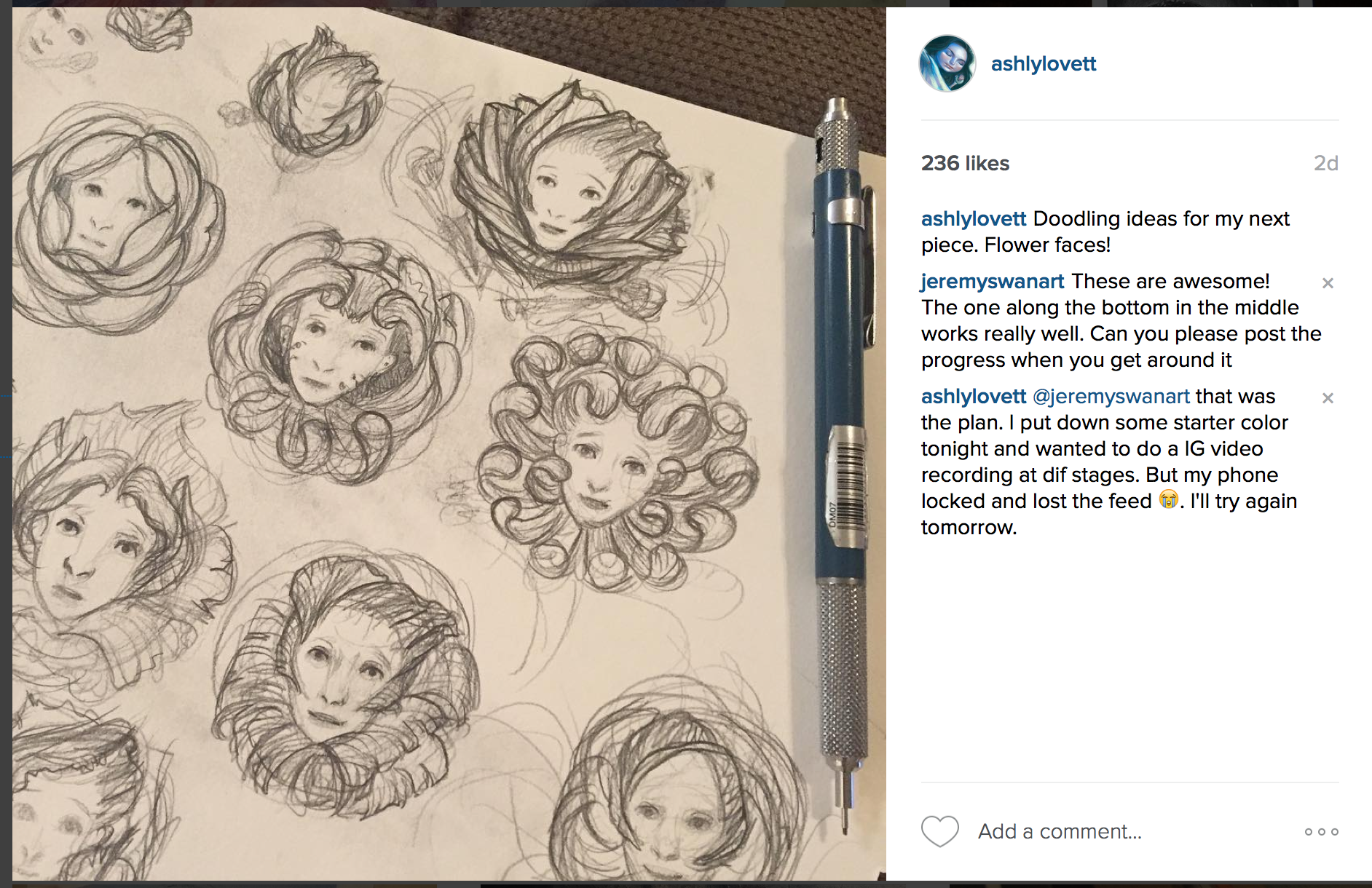

12x12 chalk pastel on BFK RIves paper.
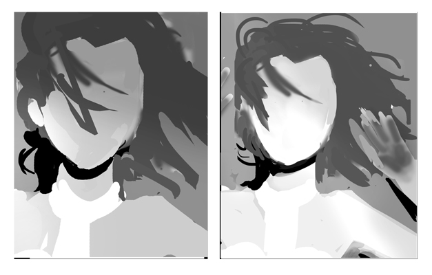
I notice people really like these time-lapse video, so I'm going to try and post longer ones. After seeing the color quality of this video, I'll be researching cameras. The color is SO far off, but at least you can still see the values clearly. In all my videos I do lot of trial and error till I'm happy with the color and drawing. I think this history of color is what gives my illustrations more life. I also want to say that it is truly useful to not be precious with your work. Sometimes you need to be willing to destroy your illustration, so you can build something better. It may help to think "If I did it once, I can do it again." An excellent artist to follow for this is Vanessa Lemen. She did 2 post on Muddy Color: Painting Process and A Spontaneous and Responsive Process.
In my last post I spoke about implied lines in my composition. As you can see below (middle image) I use a lot of implied lines to help your eye travel around the flower petals in a spiral. I then had to use the background to keep your eye within the center. Because I used such a blunt and centered composition, I wanted to continue this theme of symmetry by making the subject looking directly forward. Everywhere outside the face has a lot of energetic, organic lines and the smooth face makes a great contrast and gives the eye a place to rest. And with all these swirling organic shapes everywhere, I knew I needed to anchor the piece was horizontal implied lines (far right image.) My line work is naturally organic and an instructor pointed this out to me one day. Since then I try to incorporate geometric (strong horizontal and vertical) line work to help contrast and strengthen my organic way of working.

I turned to a lot of my favorite artists for this project. James Jean and Loish were big influences I think. I also really wanted the character's face to have very open bright eyes. I thought instantly to the Forest Spirit in Princess Mononoke. I always loved how "knowing" those bright eyes seemed.
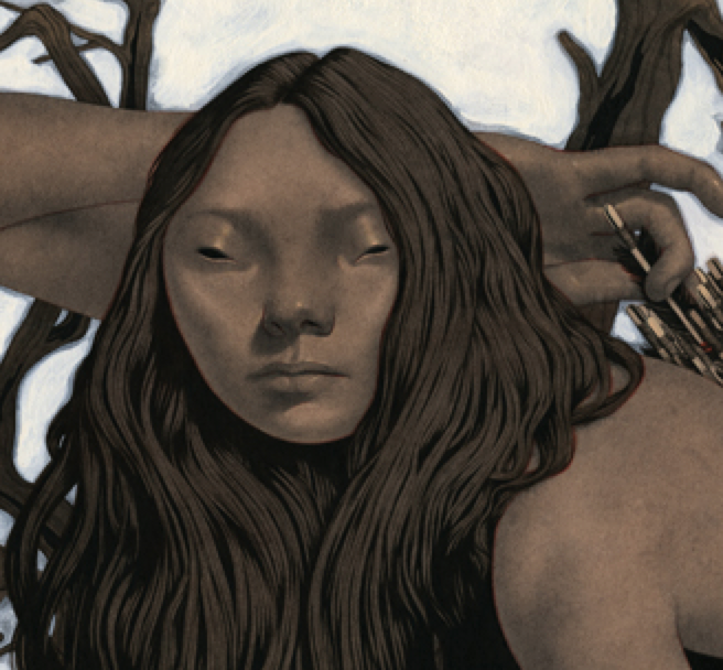
This piece was intended for Week 3 of Month of Love with the theme word weapon. I felt Crimson Peak was an excellent fit considering that love being used as a weapon is a repeated theme throughout the film. Crimson Peak is a gothic romantic and simply beautiful. Here is the trailer. Even though I missed the deadline for Week 3, I'm happy I got this illustration where I wanted it. This piece took me a lot longer to complete and I even started over 3 times. Perseverance and stubbornness prevailed. The color pallet was a lot of fun to play with. I used a lot of blues and purples and warm greys for the hair. I love my Sennelier Burnt Madder red pastel for the blood/red clay and how it popped with this subdued pallet.
I've been a huge fan of Guillermo del Toro's Crimson Peak since I first saw it at the movies. I illustrated another tribute piece Thomas. To see Thomas and a 4 min time lapse video of its making, click here.


This background was a great tool to put in some implied lines and keep your eye moving around the composition. MuddyColors did a good post about this. I highly suggest it if you are looking for ways to strengthen your illustrations.
Below is my reference/inspiration. Including my self-reference. Self-sticks are very useful for this. Especially if you're out of town, in a hotel, and don't have your usual models! Luckily, the hotel had an excellent knife to work with.
I know they used Pre-Raphaelite reference for her character sheet, so I tried to keep that in mind when designing this illustration. I wanted soft tones and that flowing hair.
Lastly, I encourage you to Follow my Instagram if you like seeing process work. IG is the first place I go to to share whatever I'm working on in the studio.


Each week of the month of February, I'll be doing an illustration based of the given word or phrase. Learn more about Month of Love here. You can also check out my pieces from the last challenge Month of Fear.
This weeks phrase: Lost in translation. The Language of Love has many dialects. Sometimes we’re fluent and other times… it’s all Greek.
LeeLoo from the awesome film The Fifth Element. Original chalk pastel on BFK Rives Paper. This piece illustrates the first moment she sees the futuristic city of New York. See my time-lapse video below, which shows my initial process when putting down a free form drawing.
Challenges for this illustration:
* Trying to depict Milla Jovovich's character, while still retaining my style. This was very tricky. I ended up re-watching the movie and taking a lot of screenshots. I couldn't get a straight up great reference photo. This was a good personal challenge for me. I also researched all of Milla's photo-shoots during 1995. She is so purdy. I felt the key would be to nail her mouth since it is her most distinct feature. Also, Leeloo often had an opened mouth expression.
Few of my quick thumbnails. The project went fast since it took me a few days to decided on a concept for this week's challenge.
• This scene illustrates her first moment seeing futuristic New York and the cops have her in a spotlight. The face is practically fully lit, which can flatten everything. I really had to control my values, control my line work, and use what shadows I had to balance everything. Usually, my pastel strokes are smooth and organic and I'll love to render out areas like the hair. But considering the chaos and anxiety of the scene and the high key values, I wanted more energy to compensate that. So, I used hard strokes within the face and kept the hair mostly gestural.
• I originally wanted to have her hands up covered in soot, like in the movie. However, I nixed it because I felt the piece was too busy with more information. I also tilted the composition to make it more dynamic.
Project Description: It took me a few days thinking on this week's phrase. It was very hard not to just think of the literal movie, Lost in Translation. Luckily one morning Leeloo popped into my head! I find my best inspiration when I'm initially waking up in the morning and cruising through artwork on IG. Leeloo is a supreme being that is awoken 5,000 years later to a future with flying cars and space travel. She was created as a weapon to save the human race from a “great evil” that is literally a dark planet hurtling towards Earth to destroy everything. I felt Leeloo’s journey was a good fit for this week’s challenge. From the beginning of her waking, she dealt with controversy. And when she looked up the word “war,” she became even warier of humans and their overwhelming will to destroy each other. It took good ol’ Bruce Willis (playing Corbin Dallas) to explain that there are many things worth saving, like love. He then kisses her and she’s a happy weapon again and destroys the “great evil” seconds away from its impact with Earth. Fin.
Side Notes: At the end of the film, Leeloo really gives Corbin quite an ultimatum. Say you love me or Earth dies, lol. All kidding aside, this is a beautifully entertaining movie. One of my favs.


It is now Month of Love! This is very similar to Month of Fear. Each week of the month of February, I'll be doing an illustration based of the given word or phrase. This weeks word is "hero." Learn more about Month of Love here. See my entry here!

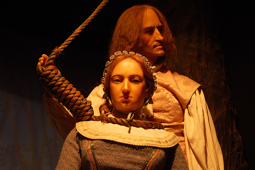
Lisbeth Salander from the novel Girl With the Dragon Tattoo. 11x16 chalk pastel on BFK Rives Paper. Digital manipulation with Photoshop. I chose black and white because I felt it wasn't what you'd typically see when glorifying someone. Just like Lisbeth's character wouldn't typically be the hero of any story.
(Spoiler alert for book readers) I wanted to do a hero that isn't the typical "hero" image. Set during winter in Stockholm, Switzerland, Lisbeth Salander from The Girl with the Dragon Tattoo is a 24-year-old 4' 11" petite woman weighing hardly 100Ibs who dresses like a goth with piercings and tattoos. She is often mistaken for a 14-year-old. At the time I read this novel, I related instantly to this character because I too was in my early 20s, 4' 11" (no joke), petite, and often (SO OFTEN) mistaken for a teen. Throughout the novel, there is this constant motif of inaccurate judgements due to one's appearance. Lisbeth Salander is laconic and withdrawn to the point that she is judged by others to be incompetent. But in reality, however, she is an extraordinarily intelligent hacker and very capable of taking care of herself. She dishes out justice to those who wrong her and even saves Mike Blomkvist life at the end of the novel. Lisbeth Salander is one of my favorite female protagonists. She is misjudged due to her personality, her past, and appearance. Ultimately, she uses the misjudgments of others to her benefit.
Throughout the text, Salander occupies the role of both victim and survivor. Assaulted repeatedly and brutally by her guardian, Salander seems aware that others perceive her as a victim, but she doesn’t view herself as one because she sees the oppression and brutalization of women as endemic to society. In other words, she is not being singled out for abuse, and so views the abuse as a general problem rather than one directed at her personally. Ultimately, her notable outbursts of violence against her guardian in the novel exemplify both Salander’s desire to secure her own survival in the face of overwhelming odds and to punish those who victimize the powerless. Additionally, almost all of Salander’s actions serve to secure her independence and give her the means to protect herself.

After watching that movie I was bouncing in my seat from all that art eye candy or as Guillermo Del Toro put it "eye protein." Every frame was breathtaking. There is one scene at the beginning of the movie featuring a social event. And I swear frame by frame it looked like something out of a painting. And the house...I could go on and on about how beautiful that movie was. You could tell all the designers put their heart into that production.
With all that said, I really wanted to do an illustration in honor of that amazing film. Even though I was rambling to my husband as we left the movie theatre about how gorgeous my next illustration was going to be, I was actually overwhelmed by the time I got to my studio. I want to say SO much, but what to say and how to do it?
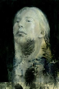
So while I try to dissect this more involved illustration for Crimson Peak, I had to do something to satisfy this desire. Thus this chalk pastel portrait Thomas
My time lapse video of the making of Thomas. This is my first time doing this, so I hope it is informative. I'll try to make this more of a habit for future work. And maybe add music next time :P

My tool of the trade: Nupastels. I'm trying out a method were you store the pastel sticks in rice to keep them cleaner.

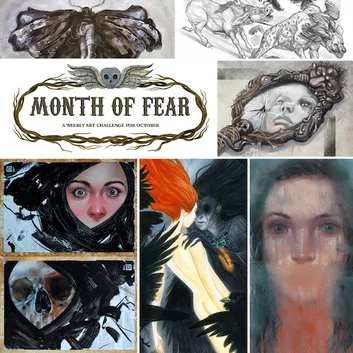
Now that Month of Fear is complete I wanted to share all the blog reviews I was included in by Samuel Flegal. I was very excited to be paired with all the other awesome artists.


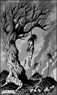
Happy Halloween! My last submission for Month of Fear: Dance ofMacabre: dance of death. Done with chalk pastel and Photoshop
The meaning emphasizes that in death we are all equal regardless of our social status and former life. This made me think immediately of the Underworld where all souls go in Greek’s mythology. It was said you must place coins on the deceased’s eyes, so they had money to pay the ferryman to cross the river of Styx and enter the Underworld. I really loved the imagery.
It has been a fun ride with this year’s Month of Fear. So many great pieces and new artists discovered. I want to thank Kristina Carroll for starting this great tradition. I really look forward to it next year. Until then, Month of Love is just around the corner!


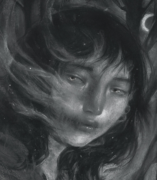
My third entry for the Month of Fear. Learn more about this monthly challenge at MonthofFearArt.com
What Lies Beneath
There were many ways to run with this. I was interested in deception and what lies beneath the trees. In folklore throughout the centuries, forests have represented a place of wonder and fear. Deogen “De Ogen” or The Eyes is a ghost often seen as a fog form haunting the Sonian Forest, in Belgium.
The challenge with this piece was controlling the values and keeping the viewers eyes moving around the piece.
Next week: The Dance of Death unites us all.

My second entry for the Month of Fear. Learn more about this monthly challenge at MonthofFearArt.com
This weeks word: Sabbath
This topic was a bit overwhelming for me. You can go a million directions with witches and demons and witchcraft and spells and Harry Potter...
In my last piece I was exploring death and I decided to continue that motif with the Salem witch trials. In Reflection there is a victim and in Trial there is a fighter. I really enjoy the comparison of the two. Each piece has a different energy when dealing with the same subject of death and murder.
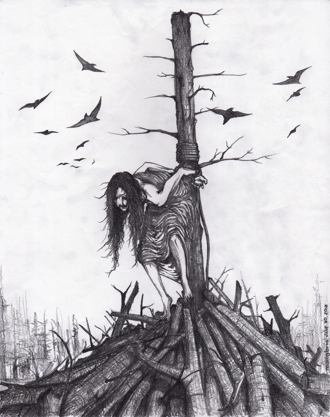
Anyway, luckily I had some rope from a previous reference shoot and I tied my first ever noose! I love how you can Google anything. I've never done an illustration where the subject is back lit. I felt this value structure would compliment my subject matter and be a good exercise for me.
Below is some of my process work and a close-up shot of this piece.

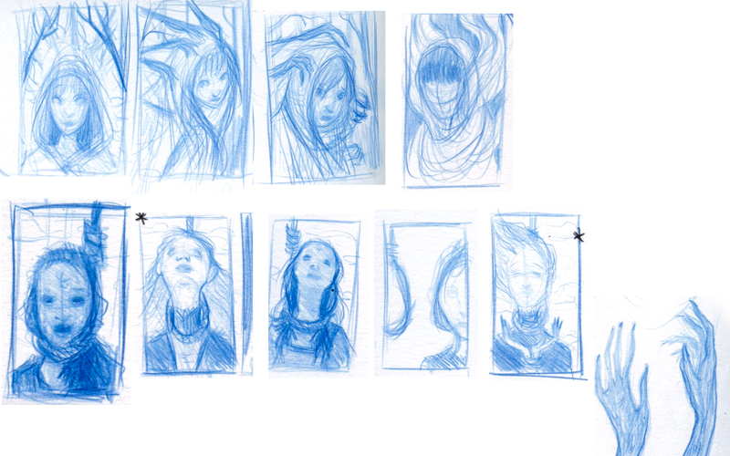
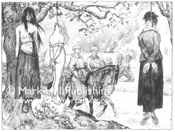
Above are some of my thumbs. I really liked the top row. I may explore that further for a future piece. I decided on the straight forward comp because I really wanted an intense look and the opportunity to play with bold shapes. Below is a small collection of the inspiration I used.

I wanted to participate in this year's Month of Fear, which is " a weekly art challenge created by Kristina Carroll for the month of October. It was designed to inspire artists to get together, shake things up, push themselves and create a bunch of new personal work. We do another monthly challenge in February called Month of Love."
This week's word was Mirror: Reflection, deception, spirits and secrets.This is darker than most of my current work, but I wanted to step a little further out of my circle and challenge myself with a more serious piece. This one is titled "Reflection". Next week's challenge is: Sabbath Witches and devils.


These process images are crude and taken with an iphone, but in my defense these were intended for my own personal documentation and not a demo. So here it is: I sketched in my base drawing with nupastels. Next, I went over certain areas with a sponge brush soaked with water. It gives the pastel a "paint" quality and dries with interesting textures that I knew would work great for this concept. I want to stress that this was done on BFK Rives cotton rag paper, so it doesn't buckle. Once dried it was a process of refining my shapes and trying to give it that foggy mirror look, which was an interesting challenge. The solution of using a fogged mirror helped make this story less gruesome and more appealing to a broader audience. ;)

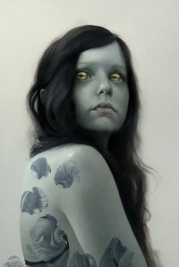
My husband and I have been big fans of Ink Master, a reality competition tv show. Tattoo artist compete against each other weekly with different challenges. There is always an American Traditional style challenge. I love the bold line work and and big eyes of the stylistic women. I had to do a tribute, which would mix my style with the bold decisions making of Traditional.


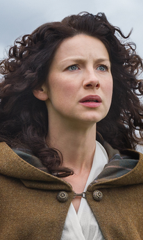
I start all my portraits off very vague and slowly try to find a drawing within my shapes. Sometimes I find inspiration from music or possibly what movie or audiobook I'm listening to. This past week I caught up on the TV series Outlander (also a great book series) playing on Starz, which features female heroine Claire Beauchamp Fraser. So unintentionally my drawing ended up reflecting a lot of Caitriona Balfe's features. :)

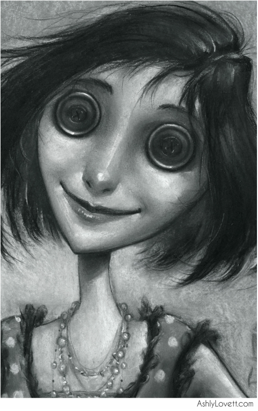
As you can see from my portfolio, I am a big fan of Neil Gaiman's book Coraline. I'm in love with the visuals and the way it is written.
I wanted to do a spot illustration of the other mother when she is first introduced to the reader.
It sounded like her mother. Coraline went into the kitchen, where the voice had come from. A woman stood in the kitchen with her back to Coraline. She looked a little like Coraline's mother. Only...
Only her skin was white as paper.
Only she was taller and thinner.
Only her fingers were too long, and they never stopped moving, and her dark-red fingernails were curved and sharp.
'Coraline?' the woman said. 'Is that you?'
And then she turned around. Her eyes were big black buttons.
'Lunchtime, Coraline,' said the woman
'Who are you?' asked Coraline.
'I'm your other mother," said the woman. 'Go and tell your other father that lunch is ready.' She opened the door of the oven.

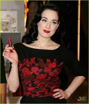
I've gathered a lot of inspiration from Dita Von Teese

Brain storming sketch.

One of many 1950s references for "the perfect mother, wife, and home." Yick.

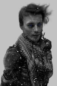
Latest portrait illustration of Jack Frost. Most of my portraits are quite like Ella. This time I wanted to play with organized chaos with a low key lighting. I'm planning a very colorful Golden Compass illustration that's going to involves the Northern Lights, so this helped me workout some decisions. These portraits are about fun and working out problems before a big color piece.
I wanted Jack Frost to be an androgynous character. I needed to balance the smoothness of his face with the crisp lines of his hair and surroundings. Also wanted the flow of the wind to show with my stroke choices in the background. There are things that I do and don't like with this one, but over all I'm happy with it.
Below is a close up. I even added ice on his eyelashes after watching Narnia for inspiration :P

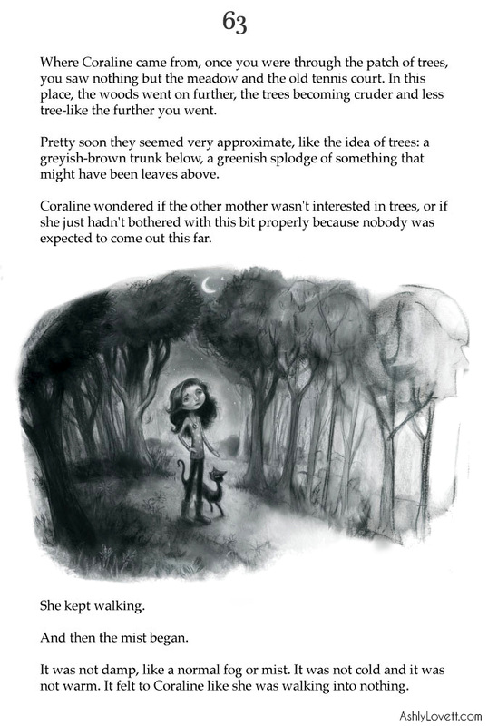
"Coraline wondered if the other mother wasn't interested in trees, or if she just hadn't
bothered with this bit properly because nobody was expected to come out this far.
She kept walking.
And then the mist began.
It was not damp, like a normal fog or mist. It was not cold and it was not warm. It felt to Coraline like she was walking into nothing. "
- from Coraline, by Neil Gaiman
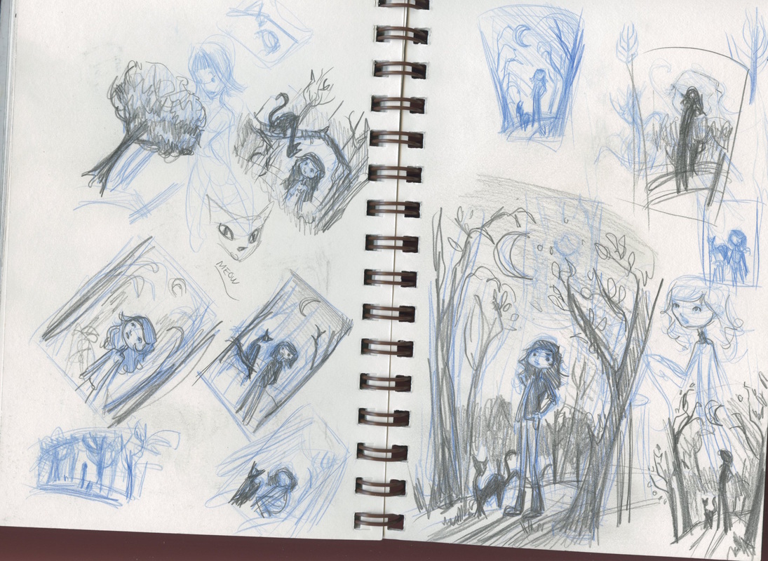
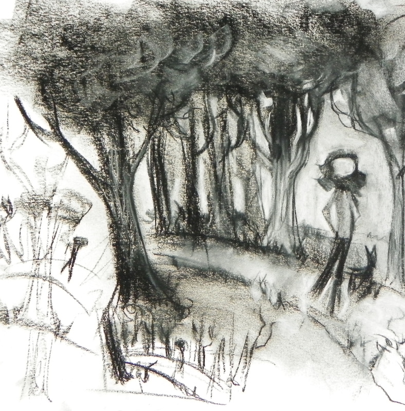
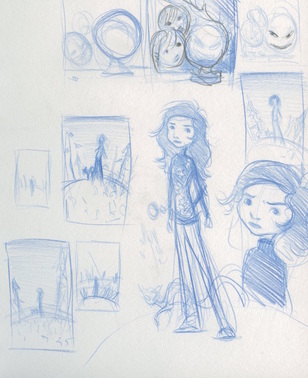
This particular spot is when Coraline is walking through the woods in the other mother's created world. I always loved the imagery of this passage and was inspired to do my own spot illustration for it. Below are close-up and further down is some of process my work.

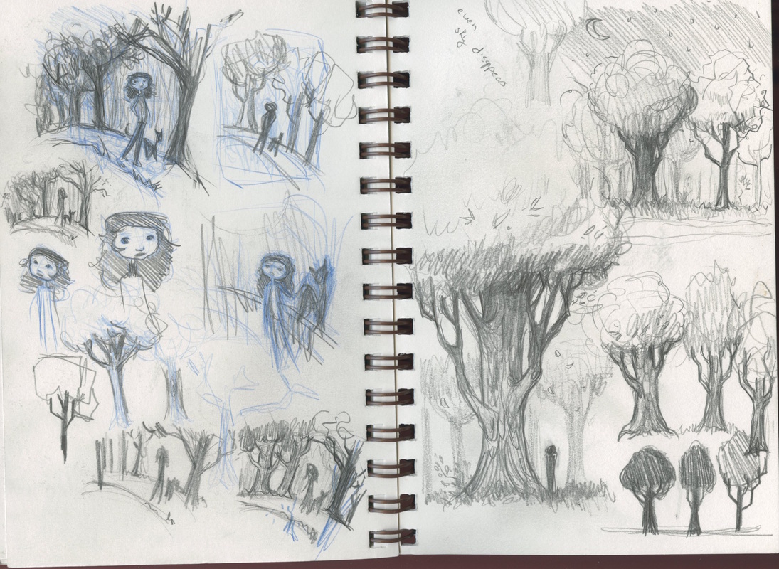
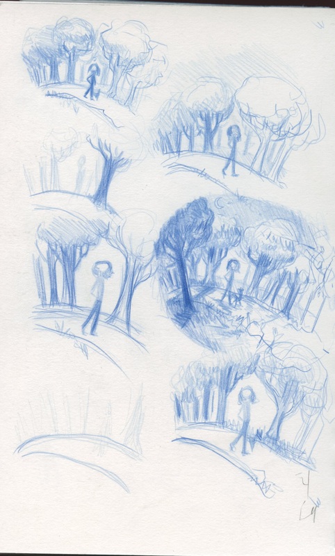
I knew I wanted an illustration of Coraline walking through a forest that rapidly had trees started turning into "an idea of a tree." I usually already make my backgrounds suggestive and loose, so it was a fun challenge working with my style and still having my illustration read as a forest turning into nothingness rather than an illustration that isn't finished.
My initial sketches and media test:


I like to do black and white portraits to warm up. There is no planning. Just some reference and a white piece of paper. It is relaxing for me and a good way to ease into a more complicated piece later. I named this one "Ella" after a book character from the current audiobook I'm listening too. I often name my portraits after songs or book characters.
I had a lot of fun with this one. I wanted to add a little narrative since I often don't with my portraits, so I needed to consider what environment she was in. The character has a lot of curves to her face and hair, so I knew I needed some strong straight lines to help compliment all those curved shapes. A forest. I added debris to her hair to let the audience ask questions about this character's story. Why is she in a forest? Who is she? Who or what is she staring at? so on and so on....
The inspirational reference I used for this portrait. I looooved her hair. I also thought it would be a good challenge working with the texture of her hair vs. the feather thing vs. the smoothness of her skin. I also loved how her face *pops!*
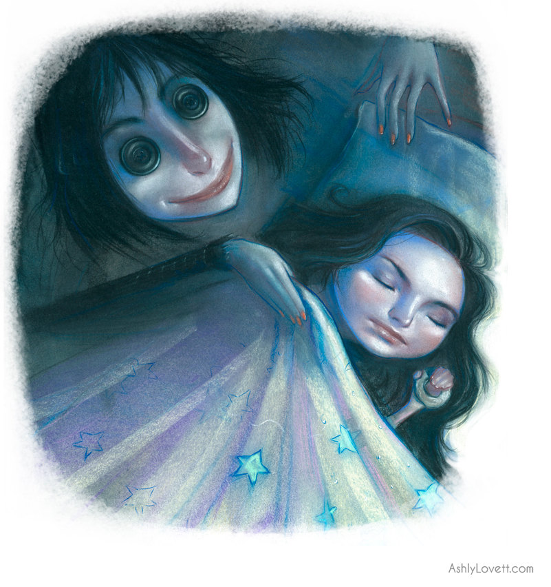
"Coraline closed the old wooden door, turned out the light, and went to bed. She dreamed of black shapes that slid from place to place, avoiding the light, until they were all gathered together under the moon. Little black shapes with little red eyes and sharp yellow teeth. They started to sing,
We are small but we are many
We are many we are small
We were here before you rose
We will be here when you fall.
Their voices were high and whispering and slightly whiney. They made Coraline feel uncomfortable..."


Then there is my favorite character Cat.
"...Coraline also explored for animals. She found a hedgehog, and a snake-skin (but no snake), and a rock that looked just like a frog, and a toad that looked just like a rock.
There was also a haughty black cat, who would sit on walls and tree stumps, and watch her; but would slip away if ever she went over to try to play with it."
One of my favorite sayings from the Cat:
“We...we could be friends.'
We COULD be rare specimens of an exotic breed of dancing African elephants, but we're not. At least, I'M not.”


She looked a little like Coraline's mother. Only...
Only her skin was white as paper.
Only she was taller and thinner.
Only her fingers were too long, and they never stopped moving, and her dark red fingernails were curved and sharp.
- From the novel Coraline by Neil Gaiman.
I love this book. The visuals are amazing and honestly its super freaky. I could have made the "other mother" much much scarier, but in the end it is a children's book. There are a lot of subtle metaphors describing her like a spider and Coraline as her prey. That is something I'd like to explore further in future Coraline illustrations.