I did some live figure drawing for the first time in a loooong while. Wanted to share. 15-30 min poses. Chalk pastel on Newsprint.


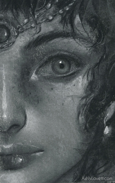
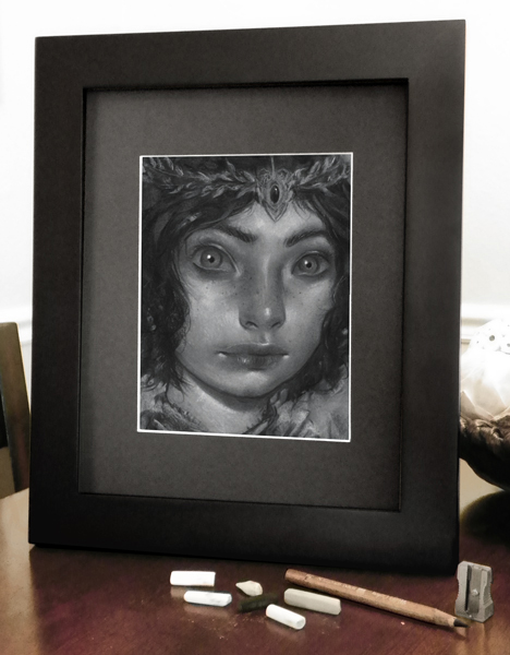
Month of Love: Hester Prynne
Hester Prynne from the novel "The Scarlet Letter". Created with chalk pastel on paper.
My piece created for Month of Love a yearly challenge held in the month of Feb. I'm thrilled to be a roster artist again this year. Each week artist are given a word to interpret.
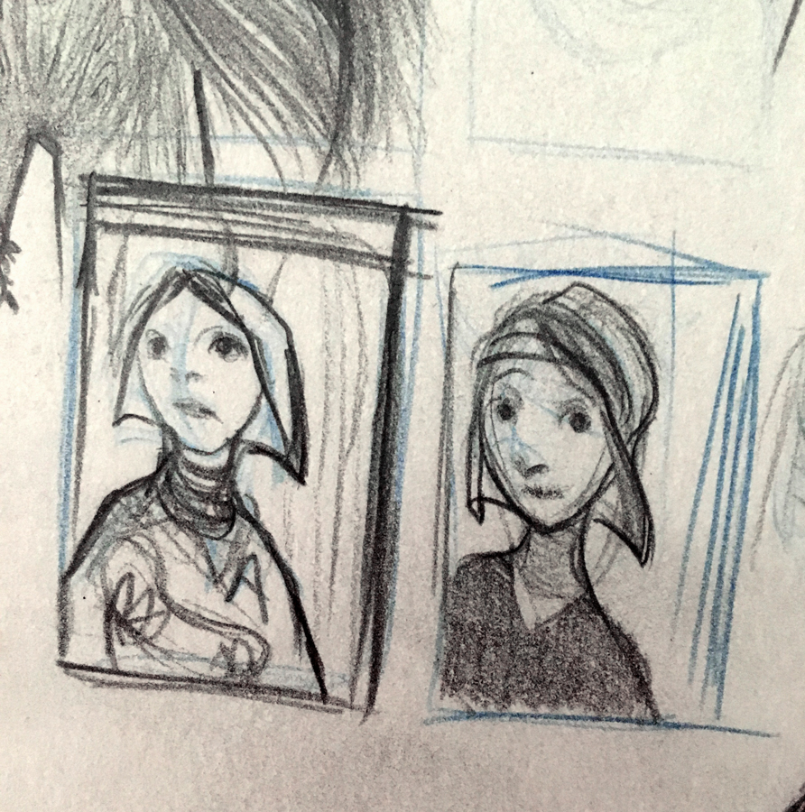
The first week's word was "secrets." I originally thought I could do some spot illustrations to add to my portfolio. But eventually, after some doodling, I noticed offhandedly one of my sketches made me think of a pilgrim. And that train of thought made me think of the novel "The Scarlet Letter." Perfect for secrets and romance! Here is a plot summary for this novel.

Thoughts:
I feel good about the composition and the negative space which is intended to have text. I wanted to do more narrative work and play around with new lighting. I'm satisfied with the outcome. I wasn't sure about the solid A, but I think it balances well with overall drawing and shapes of the piece.


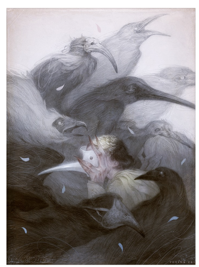
My reference/ inspiration gallery of photos and other artist work. Includes the amazing Audrey Benjaminsen, Sam Weber, Ed Kinsella, and others.
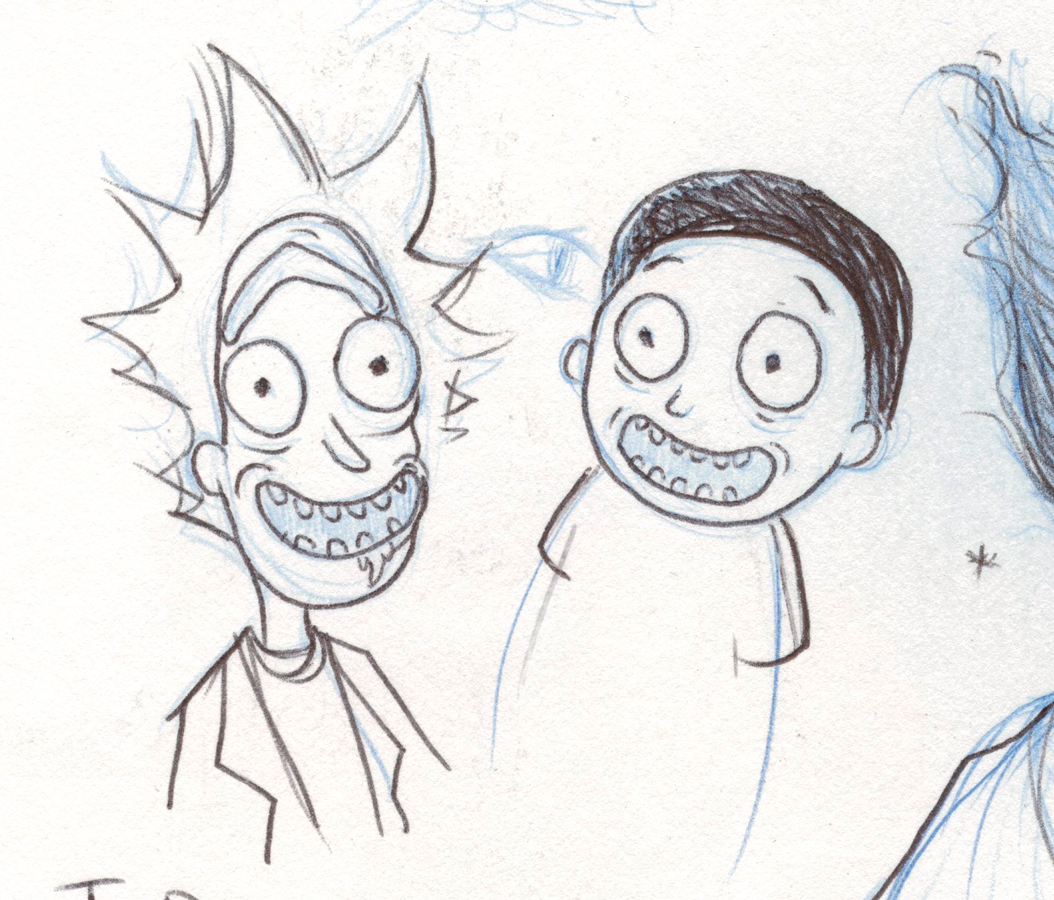
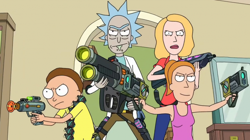
Rick and Morty Process Work and Demo Video
Very happy to announce that I'll be participating in 4 group shows this year with Gallery 1988 in Los Angeles, CA. They are well known for curating pop culture shows and I'm honored to work with them!
I'm starting off the year with the first official Rick and Morty art show, which opens tonight at 7pm-9pm at Gallery 1988 West. Rick and Morty is a cartoon featured on Adult Swim. If you can't attend, the show is online (click here.)
There you can purchase the originals (Update: Rick sold) or 1 of 10 limited edition prints (Update: First edition sold out. New 11x14 variant prints now available. Click here to purchase). Below is my chalk pastel piece titled "Rick" which will be in the show.


Process Work
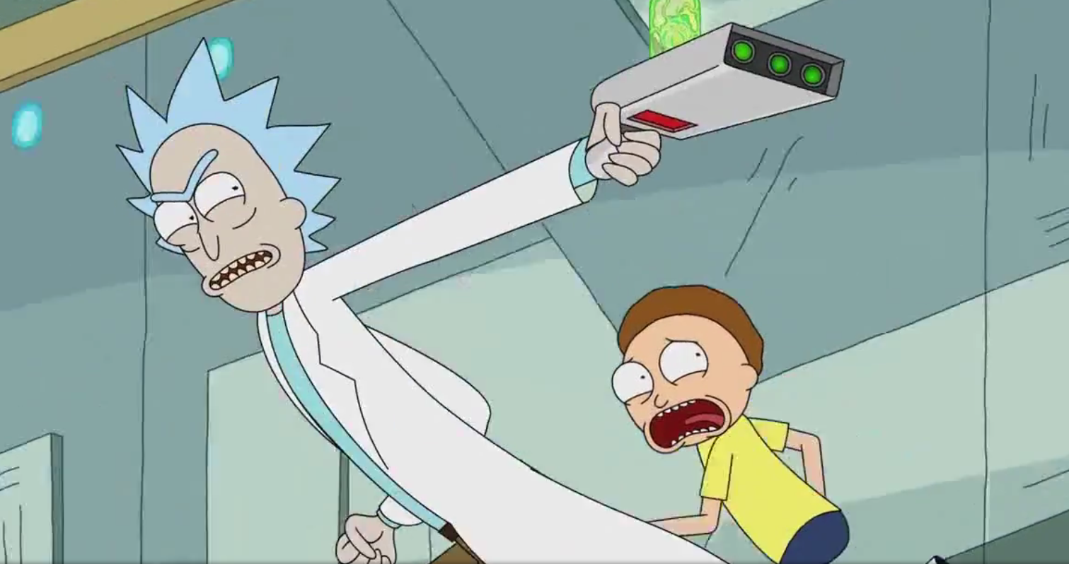
Sketchbook phase first. I needed to understand what made these characters look like "them". Learn the subtleties. I found that I needed to be careful with my line work and placement of the nose and eyes. Otherwise, they'll start looking like a muppet. After a few episodes, I eventually I got the swing of things. It's interesting that they make their pupils squiggly.


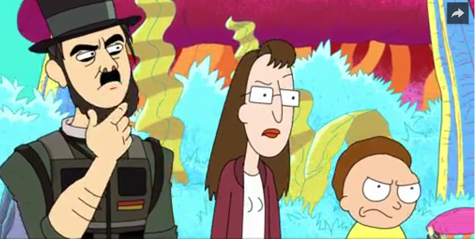
If you are unfamiliar with the show, it airs on Adult Swim and is moving along to a Season 3. This promo videos does better justice in explaining the show I think. Enjoy! It's hiliarious.


From the sketch phase. I collected reference photos from the show to get to know the color palette and wacky characters. My initial idea was to do a more illustrative piece, but even after a lot of process work, I decided against it. I love portrait work and that is what I sent the gallery when they accepted my portfolio. If I want to explore more illustrative work then it needs to be with another project. Always a good lesson to know it's ok to throw out hours of process work if the idea from the beginning is just not a right fit.


Time-lapse of my chalk pastel drawing of "Rick"
I wanted to make sure I didn't make Rick a nice guy. He is a selfish sarcastic old man who gets drunk all the time. I also really wanted to make sure he had a long face and hair that mimicked the same silhouette. And that uni-bro. I had to give it justice!
What about Morty?

After finishing my Rick portrait, I thought, "Why not do a complimentary Morty piece?" The deadline for the artwork was no later that Jan 6th and the gallery gave me the OK. I finished and shipped my Rick portrait framed and ready on the 22nd. I started a Morty portrait but realized I didn't want to rush it. Morty was a more difficult subject matter due to the fact that his character is made to be less interesting that Rick. I mean...it's not hard to make an eccentric drunk scientist with crazy hair into an interesting portrait. Also, Rick was an old man, which gave me many opportunities to play with lots of line work and interesting marks because of wrinkles. Morty is 14.
You have Morty who isn't very smart and below average in just about everything. His character is designed to look average. So it was a battle working out Morty's face while still trying to make his portrait stand alone. How to put in interesting mark making while still trying to keep him looking young and still in the same world as my Rick portrait? In the end, I decided it was better to just send in "Rick" for the gallery show and finish Morty as a fan art piece for myself. I'm happy with it and glad I took my time. And here he is.


To purchase the original Morty or get a Rick or Morty limited edition print Purchase Them Here at Gallery 1988's online store.
(323) 937-7088
gallery1988west@gmail.com


Rick and Morty is TM©Cartoon Network

Now available at Every Day Original
http://everydayoriginal.com/
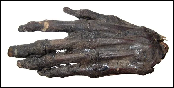
Cryptids
"There is room for a little bit of fear."
6x8 chalk pastel original on paper.
Matted in a wooden 11x13 frame.


Westworld Time-lapse Drawing
Freebie for you guys. I often share time-lapse videos on my Patreon and here is one of the latest.
Here is an impromptu chalk pastel drawing I decided to do of Doloris from the HBO series Westworld. You'll notice I play around with the placement at the beginning of this video. Totally not planned. I hope I can finish this up within the next few weeks.
See more process videos and tutorials on my Patreon:
http://patreon.com/ashlylovett
music ©Soundgarden - "Black Hole Sun"
Month of Fear Week 3: Door
Month of Fear Week 3: Door
Of course, I couldn't help but think of the book Coraline.
"Coraline’s mouth dropped open in horror and she stepped out of the way as the thing clicked and scuttled past her and out of the house, running crablike on its too-many tapping, clicking, scurrying feet. She knew what it was, and she knew what it was after. She had seen it too many times in the last few days, reaching and clutching and snatching and popping blackbeetles obediently into the other mother’s mouth. Five-footed, crimson-nailed, the color of bone.
It was the other mother’s right hand.
It wanted the black key."
click to enlarge.
Below is my reference gallery of artwork (Dave Mckean and Sam Wolfe Connelly) and photos, my own reference photography (use of grey construction paper and packing tape), my rough sketch, and uncleaned up version.


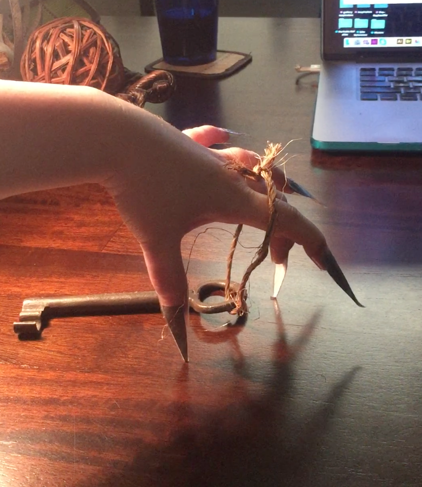


This is not my first go with illustrations from the book Caroline by Neil Gaiman. If you'd like to see the process work involved in making the illustrations below, click this tag and scroll down to see everything: Category: Coraline


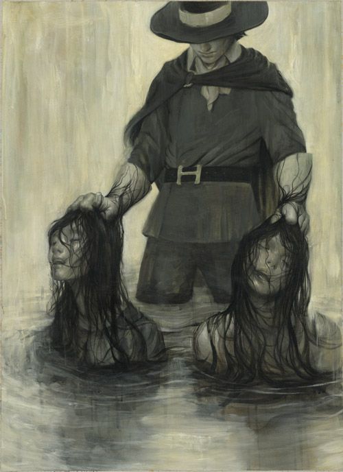
"Secrets" Illustration Mock-up
My friend John D. Wiltshire put together a mock-up design for my "Secrets" illustration for Month of Fear. I think it turned out fantastic!


Month of Fear: Week 1 Secrets

Month of Fear is back! And here is my latest piece. This first week's word is "Secrets."
To learn more about this monthly challenge click here. To see my work last year, use the link on the right.
This piece went really quickly because I had a lot of things going on this month. I started with this thumbnail and let the idea tumble around in my head.

Art work inspiration from James Jean,Rovina Cai, and others.
Interview
in News
I did an interview! Learn why I became an illustrator, what difficulties I've faced, why I use chalk pastels, etc. Read here.

Sealing Chalk Pastel
Mounting Paper on Wood
These panels were created so I could experiment with other media after I spray my chalk pastels with fixative. Often fixative will keep the piece from smudging, but it will alter the values and color, unfortunately. I'm trying out other media to decide what is the best way to work on top of the piece after fixative.
This one is called "Winter" and I used gouache and prismacolor pencils. This seems to be a good combination. You can purchase this mini-original in my store: click here.


A thank you to Kelly McKernan for her tutorial, which I used as a reference when creating this step-by-step guide. She follows up with how to varnish watercolor pieces and the post is definitely worth looking at. Click the image to see it larger or save it to your desktop.
Working on my next EDO piece!
follow this link to see a time-lapse.
Click here!

My Next Tutorial?
in Patreon
I have a list of ideas for my next tutorial for my Tier 3 and up patrons Patreon. I'll be posting options Monday, the 11th at http://patreon.com/ashlylovett. Until then, you can submit suggestions here or on my Facebook.
Demo Tutorial and Video and EDO
Here is a 60sec sneak peak of my 5min demo video that accompanies my 11 page Process PDF Tutorial. With this Tutorial I explain how to use chalk pastels and demonstrate my method with a step-by-step guide in creating a black and white portrait. This is my June reward for my patrons on Patreon.
Get all my tutorials, see in-depth blog posts for illustrations, and many other goodies by pledging Tier 3 for $11. Learn more at http://patreon.com/ashlylovett
This piece is titled "Fae" .It is a 4x6 chalk pastel piece on BFK Rives paper. It will be framed and matted and available at Every Day Original Sun., July 10th 11am EST. http://everydayoriginal.com

Chalk Pastel Demo
I'm nearly done! Many have wondered how I use chalk pastels to create finished illustrations. Pastels are a soft dry media, which can make them frustrating to use to many artists. But I personally find them very versatile and they have their own strengths compare to other media. I decided to create a PDF Tutorial explaining my method and how to handle them. I'll be including a step-by-step guide of all my stages while making a black and white portrait. I may also be releasing a bonus video of the full process with commentary later in the month. *wink wink* It'll be offered to my patrons on Patreon for $11 (Tier 3 and up.)
Patreon pledges start at $1. Sign up for Tier 3 to get all my tutorials, a patron only blog with in-depth posts explaining the thought behind my illustrations, and lots of other rewards.
http://patreon.com/ashlylovett

Tips and Tricks
I store my pastels in fishing tackle containers for easy travel. They are filled with rice, so the pastels stay clean and not rub against each other. This keeping my pastels from looking like muddy brown sticks and saves me tons of time from having to cleaning them. It also helps me keep track of what colors I'm running low on.
Learn more tips and tricks from my 5 page Setup and Safety PDF offered on My Patreon . Pledge Tier 2 for $6 to get this reward and other helpful stuff!
Pledges start at $2 and up. Help cover my cup of coffee for the day with Tier 1 Tip Jar at $2 or start accessing exclusive content with Tier 2 at $6. Go check out!
Patreon is now live!
Become my patron to support my career and receive exclusive content like extra process work, brainstorming sessions, art tutorials, and more. Pledges start at $1 and up.

Every Day Original: Pan
4x6 chalk pastel on BFK RIves paper. Available on May 10th at EveryDayOriginal.com. Check out my Newsletter for the price and frame dimension details.
This was a good challenge for me. I normally like doing portraits with dark hair, because the face is framed nicely with all that dark contrast. With this one I really had to control the values of the skin. I also wanted to have Peter Pan dirty since he was such a wild child, which adds more to the challenge for the skin tone. The old black and white 1954 film Lord of the Flies was very helpful reference for that dirty mud child look. You may also notice that Peter's eye seems to be brighter than the rest of the illustration. With my greyscale pastels, I usually prefer to use cold grey colors. However, with the pupil I used a warm light grey to give it some extra life.
"To die would be an awfully big adventure."

My Reference Gallery:
Every Day Original: Geillis
Geillis is now live for sale at EveryDayOriginal.com!
6.5x5 chalk pastel on BFK Rives paper
10x12 frame w/ matte
$250
Click to see a close-up.

Spectrum 23
in News
Claire will be published in Spectrum Fantasy Art Annual 23! This is my second year in a row to be published in this annual. To be included in a publication with the level of other artists accepted is wonderful and pushes me to do better work. I'm very excited guys.
