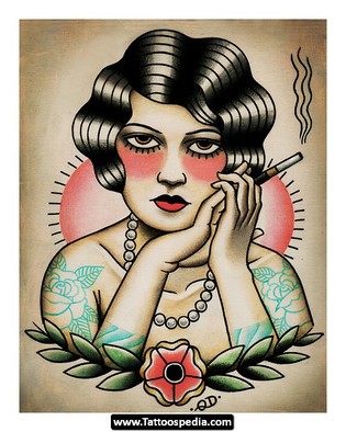
My husband and I have been big fans of Ink Master, a reality competition tv show. Tattoo artist compete against each other weekly with different challenges. There is always an American Traditional style challenge. I love the bold line work and and big eyes of the stylistic women. I had to do a tribute, which would mix my style with the bold decisions making of Traditional.
Illustration
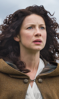
Every Day Original: Claire
I start all my portraits off very vague and slowly try to find a drawing within my shapes. Sometimes I find inspiration from music or possibly what movie or audiobook I'm listening to. This past week I caught up on the TV series Outlander (also a great book series) playing on Starz, which features female heroine Claire Beauchamp Fraser. So unintentionally my drawing ended up reflecting a lot of Caitriona Balfe's features. :)
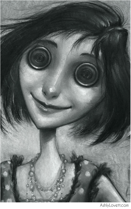
The Other Mother
As you can see from my portfolio, I am a big fan of Neil Gaiman's book Coraline. I'm in love with the visuals and the way it is written.
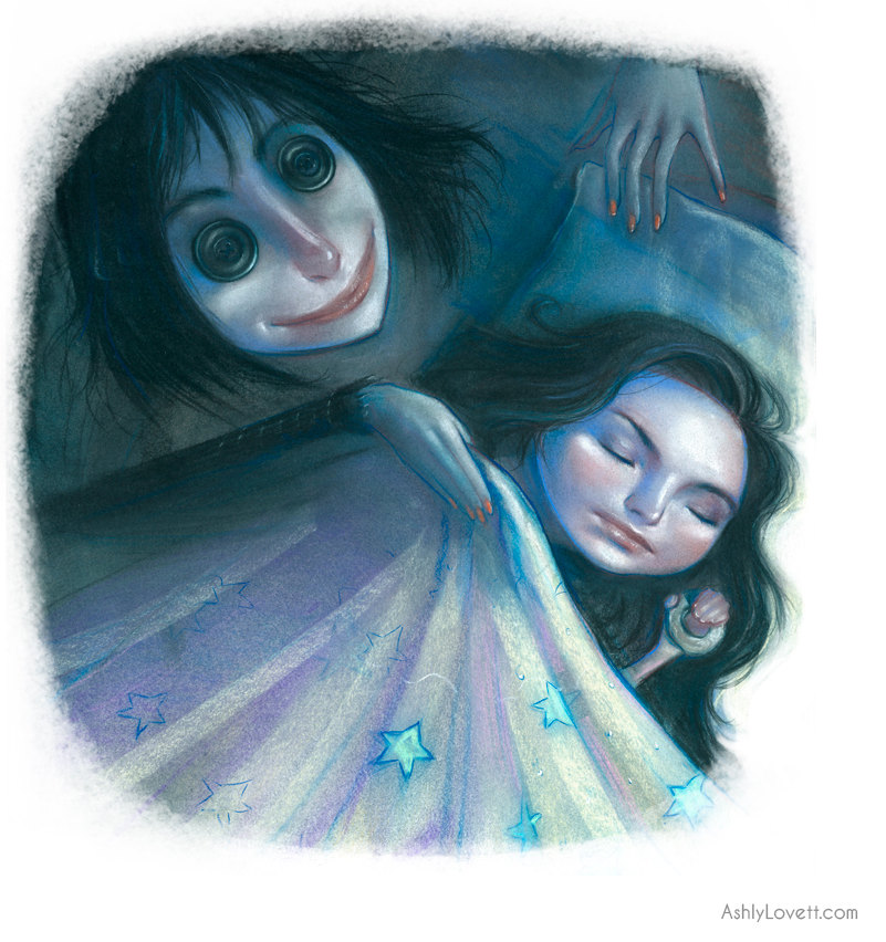
I wanted to do a spot illustration of the other mother when she is first introduced to the reader.
It sounded like her mother. Coraline went into the kitchen, where the voice had come from. A woman stood in the kitchen with her back to Coraline. She looked a little like Coraline's mother. Only...
Only her skin was white as paper.
Only she was taller and thinner.
Only her fingers were too long, and they never stopped moving, and her dark-red fingernails were curved and sharp.
'Coraline?' the woman said. 'Is that you?'
And then she turned around. Her eyes were big black buttons.
'Lunchtime, Coraline,' said the woman
'Who are you?' asked Coraline.
'I'm your other mother," said the woman. 'Go and tell your other father that lunch is ready.' She opened the door of the oven.
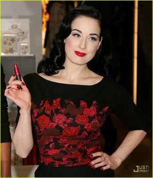
I've gathered a lot of inspiration from Dita Von Teese
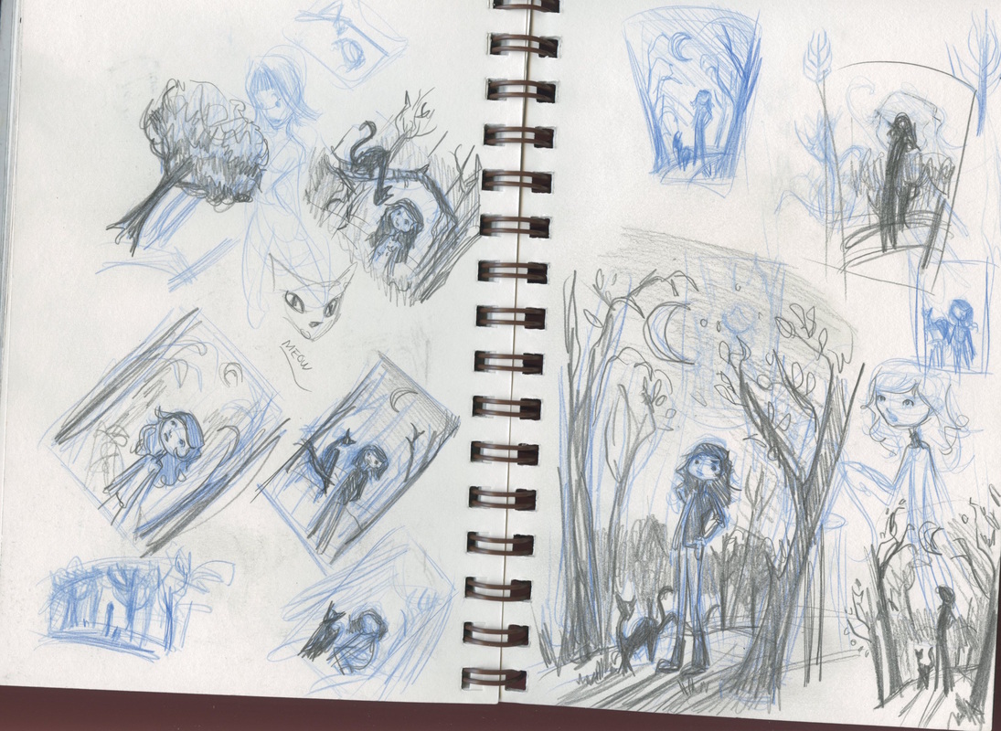
Brain storming sketch.
One of many 1950s references for "the perfect mother, wife, and home." Yick.
Jack Frost
Latest portrait illustration of Jack Frost. Most of my portraits are quite like Ella. This time I wanted to play with organized chaos with a low key lighting. I'm planning a very colorful Golden Compass illustration that's going to involves the Northern Lights, so this helped me workout some decisions. These portraits are about fun and working out problems before a big color piece.
I wanted Jack Frost to be an androgynous character. I needed to balance the smoothness of his face with the crisp lines of his hair and surroundings. Also wanted the flow of the wind to show with my stroke choices in the background. There are things that I do and don't like with this one, but over all I'm happy with it.
Below is a close up. I even added ice on his eyelashes after watching Narnia for inspiration :P
Coraline Spot
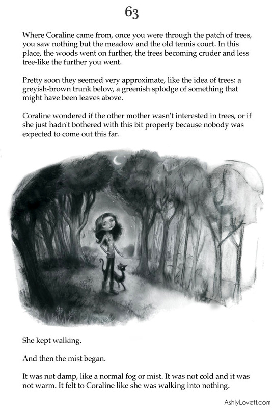
"Coraline wondered if the other mother wasn't interested in trees, or if she just hadn't
bothered with this bit properly because nobody was expected to come out this far.
She kept walking.
And then the mist began.
It was not damp, like a normal fog or mist. It was not cold and it was not warm. It felt to Coraline like she was walking into nothing. "
- from Coraline, by Neil Gaiman
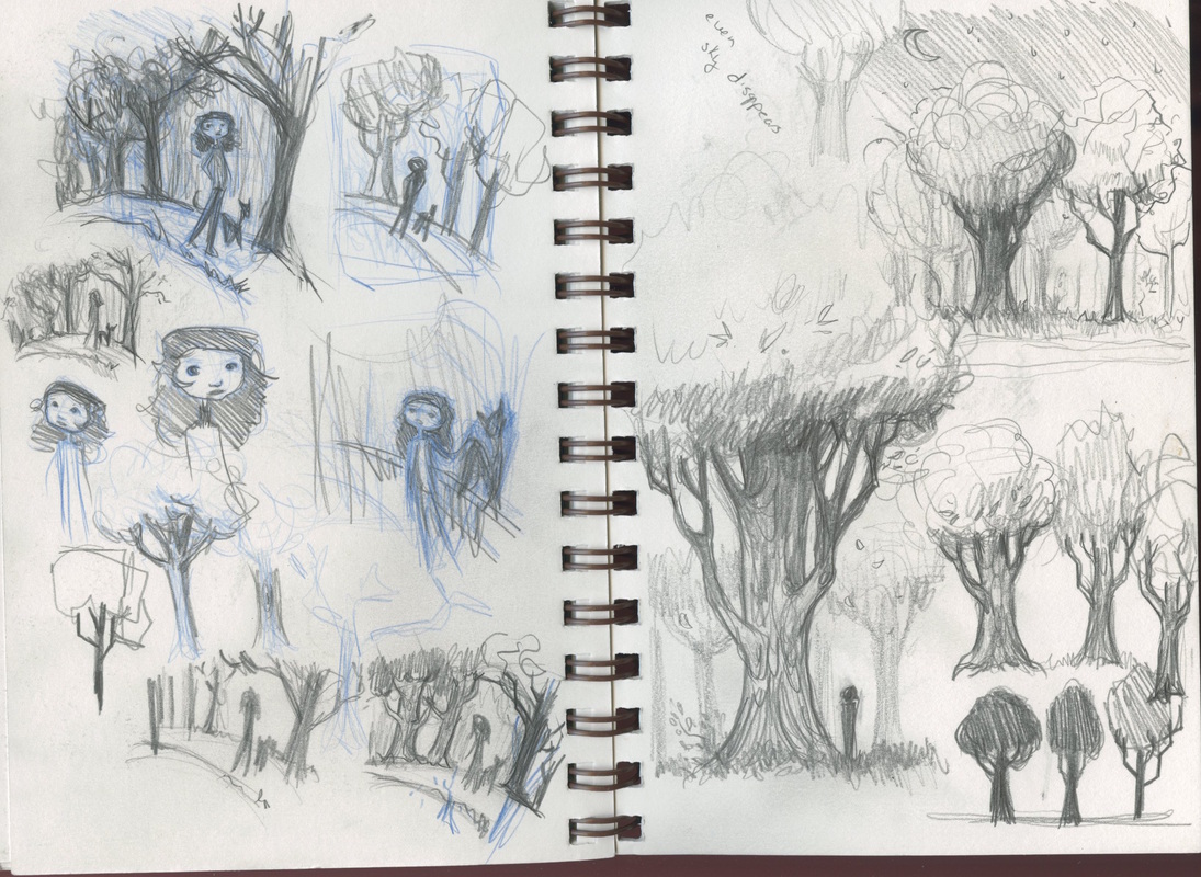
This particular spot is when Coraline is walking through the woods in the other mother's created world. I always loved the imagery of this passage and was inspired to do my own spot illustration for it. Below are close-up and further down is some of process my work.
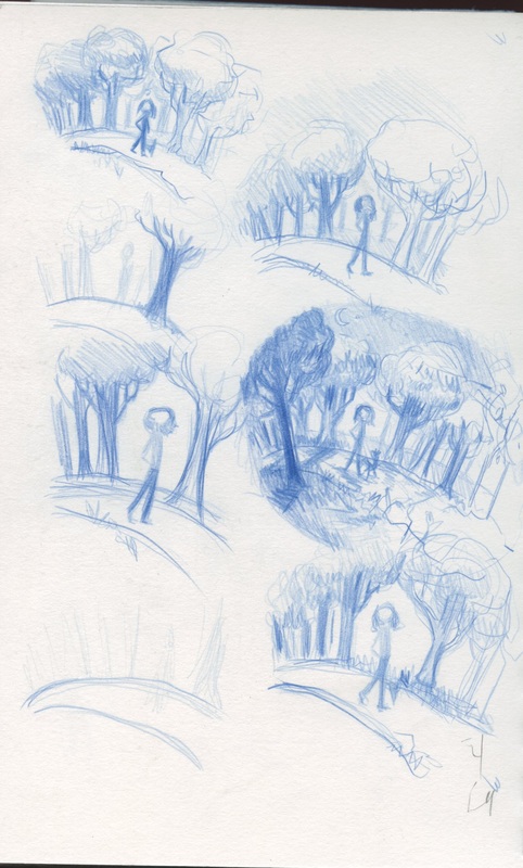
I knew I wanted an illustration of Coraline walking through a forest that rapidly had trees started turning into "an idea of a tree." I usually already make my backgrounds suggestive and loose, so it was a fun challenge working with my style and still having my illustration read as a forest turning into nothingness rather than an illustration that isn't finished.
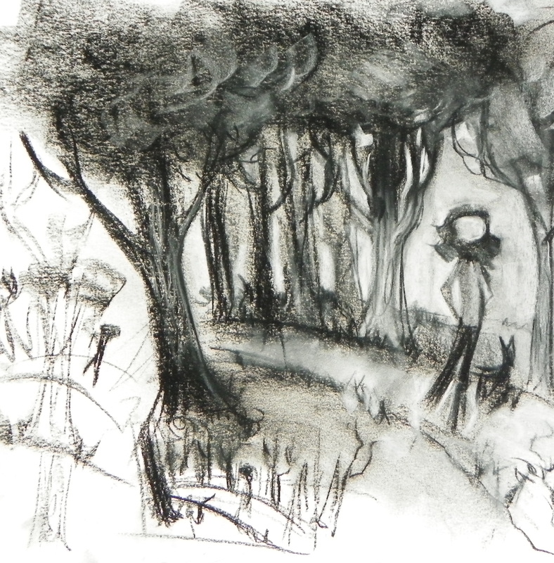
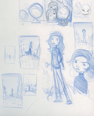
My initial sketches and media test:
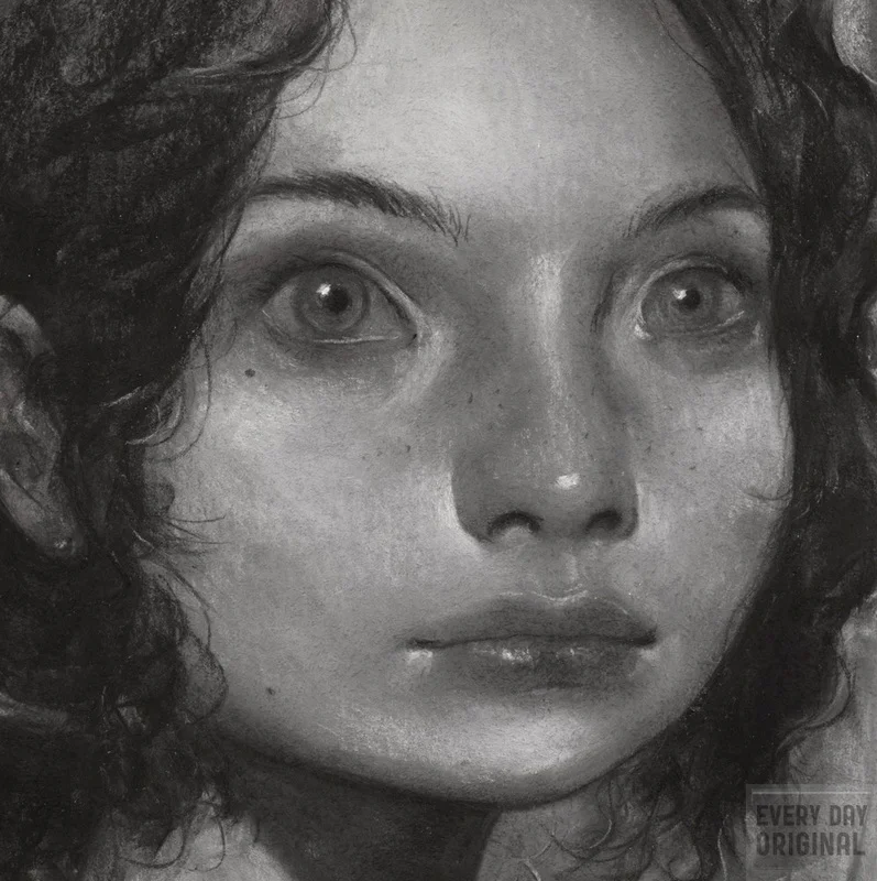
Ella
I like to do black and white portraits to warm up. There is no planning. Just some reference and a white piece of paper. It is relaxing for me and a good way to ease into a more complicated piece later. I named this one "Ella" after a book character from the current audiobook I'm listening too. I often name my portraits after songs or book characters.
I had a lot of fun with this one. I wanted to add a little narrative since I often don't with my portraits, so I needed to consider what environment she was in. The character has a lot of curves to her face and hair, so I knew I needed some strong straight lines to help compliment all those curved shapes. A forest. I added debris to her hair to let the audience ask questions about this character's story. Why is she in a forest? Who is she? Who or what is she staring at? so on and so on....
The inspirational reference I used for this portrait. I looooved her hair. I also thought it would be a good challenge working with the texture of her hair vs. the feather thing vs. the smoothness of her skin. I also loved how her face *pops!*
Coraline Spots
"Coraline closed the old wooden door, turned out the light, and went to bed. She dreamed of black shapes that slid from place to place, avoiding the light, until they were all gathered together under the moon. Little black shapes with little red eyes and sharp yellow teeth. They started to sing,
We are small but we are many
We are many we are small
We were here before you rose
We will be here when you fall.
Their voices were high and whispering and slightly whiney. They made Coraline feel uncomfortable..."
Then there is my favorite character Cat.
"...Coraline also explored for animals. She found a hedgehog, and a snake-skin (but no snake), and a rock that looked just like a frog, and a toad that looked just like a rock.
There was also a haughty black cat, who would sit on walls and tree stumps, and watch her; but would slip away if ever she went over to try to play with it."
One of my favorite sayings from the Cat:
“We...we could be friends.'
We COULD be rare specimens of an exotic breed of dancing African elephants, but we're not. At least, I'M not.”
Coraline and the Other Mother
She looked a little like Coraline's mother. Only...
Only her skin was white as paper.
Only she was taller and thinner.
Only her fingers were too long, and they never stopped moving, and her dark red fingernails were curved and sharp.
- From the novel Coraline by Neil Gaiman.
I love this book. The visuals are amazing and honestly its super freaky. I could have made the "other mother" much much scarier, but in the end it is a children's book. There are a lot of subtle metaphors describing her like a spider and Coraline as her prey. That is something I'd like to explore further in future Coraline illustrations.


